

This portrait was created using a simple RGB lighting setup with no post-production effects, just controlled colour and clean lighting. In this blog, I’ll walk through the exact gear, colours, and lighting placement I used to photograph a reflective pink outfit against a purple-to-pink gradient backdrop using blue key and fuchsia fill lights.

Intentions
Setting your intentions before a shoot is a game-changer. When you know exactly what vibe or mood you want to create, your lighting choices, like with RGB, become way more focused. Having clear intentions level you up from beginner to pro. So that’s exactly what I did.
This Shoots Intention.
For this shoot, I was going for that DJ Pop Princess music video vibe.
Bold Electric and just a little Chaotic
The RGB LED tubes did most of the work, but I didn’t just slap them on randomly, they were placed with purpose to create a full-frame clash of pinks, blues and purples (an analogous colour scheme), which are like the ultimate pop princess’ dream!).
In this blog, I’m going to show you, step by step; exactly how to build this look from scratch.

Process: How to Recreate This Look
Step 1.
Background Lights First (4 PavoTubes on white wall)
I always start with the backdrop lights because they create they set the mood for the whole shot, and position your ideas on a solid footing before playing around with placements and models.

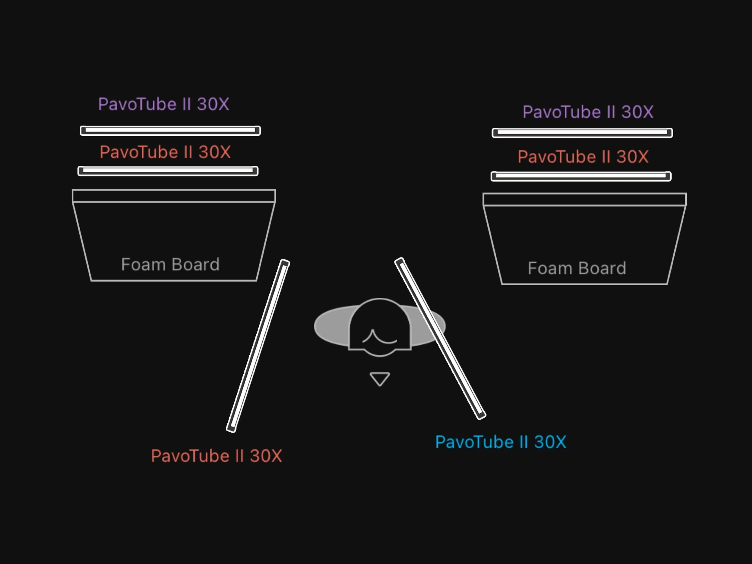
For this shot I used 4 PavoTube 30X 4ft RGB tubes, with 2 either side of the scene, facing a white wall.
After considering a couple of different combos, I went with a purple to pink gradient to match the slight gradient in the glasses.
TIP: This set up allows you to create Vertical or Horizontal gradients, depending on how you group your lights & colours.
Step 2.
Stop that Spill (2-4 Polyboards between light and subject)
When using RGB lights, it’s super important to always think about how the light is spilling into your scene, and if that’s something you want or not in the final image.
For this shot I placed a couple of Black/White Polyboards parallel, in front of my lights, with the white facing the wall and the black facing back into my scene.
This serves 2 purposes, the white side bounces the colour spill back into the wall, adding to the intensity and vibrancy of the lights, and the physical wall stops any light hitting back into the rest of the room, with the black side absorbing any extra incidental light.
TIP: Start with 2 Polyboards, and depending on the size of your room, add more to the sides to avoid as much spill as possible.
Step 3.
Key Light (1 PavoTube)
Now that the background is doing it’s thing, I can properly see how the face will interact with light. The key light defines the features and gives the image that crisp focus.
I placed the key light at about 45º to the right, at a higher angle, slightly above eye level. For this shot, my model’s skin tone looked great with a punchy, bold blue tone, which isn’t always the case with everyone. So I wanted to use that colour as my key. This created a nice contrast with the pink and putple bakground, as well as the purple of her top.
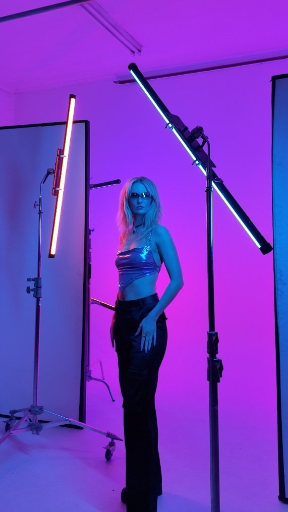
TIP: This is a super simple and easy way to position any Key light. When in doubt, set your Key light 45º to one side and 45º above eye level.
Step 4.
Fill Light (1 PavoTube)
Lastly, I added a Fill light. For this I deciced to walk the line between Fill and Rim, by placing the light more perpendicular to the model, at more of a 90º angle (as opposed to the 45º of the Key light). This create more of a ‘grazing’ of the light, depending on the way the model poses.
I did this because I didn’t want the Fill light to fill in any of the shadows from the Key, I wanted it more to add a pop of colour and excitement into the shot. This is also why I chose to make it a super bright and punchy Fuchsia, almost more into the reds.
TIP: When using bold contrasting colours as a Key and Fill, keep your eye on where the colours meet and cross over. Some colours mix at the point and turn dull or muddy. Position the angles of your lights to create less overlap to avoid this.
Gear List
-
Cyclorama, Wall or White Seamless Paper Backdrop
Position: Backdrop
Role: Smooth, black surface to light with custom colour
Colour: White
Why: Essential for smooth, consistent colour coverage
-
Polyboard, Foam board, vFlat, Flags
Position: Between backdrop lights and subject
Role: Control light spill
Colour: White & Black 2 sided
Why: Bounce light back into wall & prevent light spill into scene
-
Can use smaller size RGB Tube depending on the size of your space.
Position: At the background, 2 lights at either side and behind subject.
Role: Create gradient on backdrop
Colour:
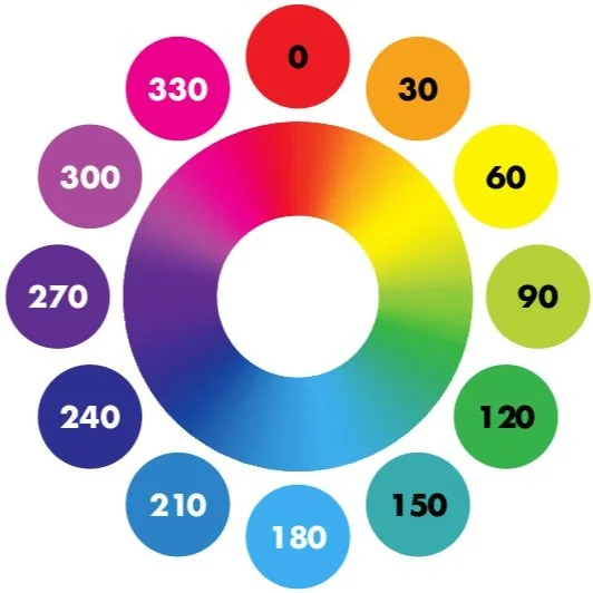
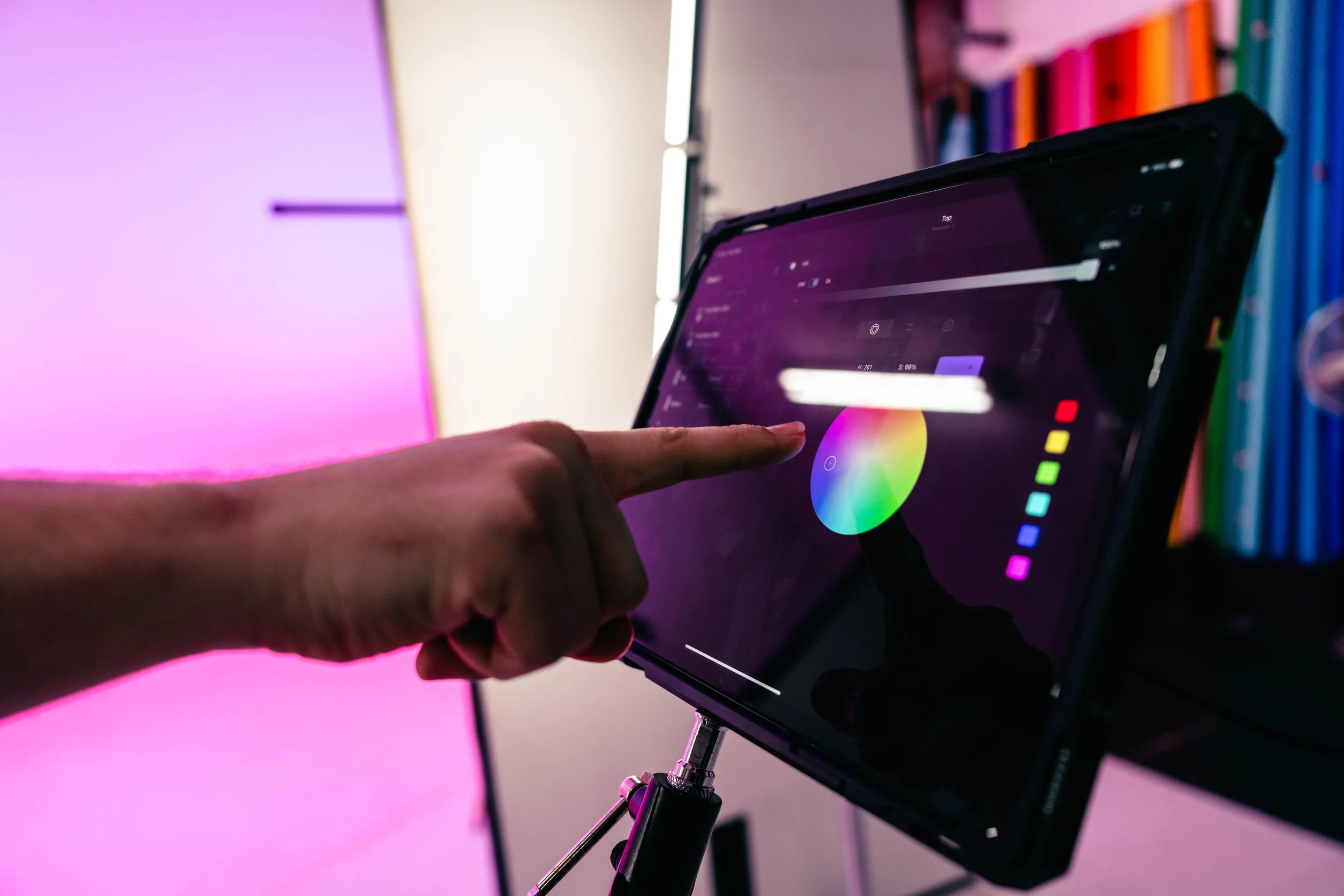
Top two: Purple at approx. H: 270 / B: 100% / S: 100%
Bottom two: Pink at approx. H:330 / B: 100% / S: 100%Why: Creates smooth, blended colour wash on backdrop; frames subject in neon glow
-
Can use smaller size RGB Tube or any RGB capable light
Position:
KEY: 45º to camera right. 45º above eye line
FILL: 90º to camera left. 45º above eye lineColour:
Key: Blue at approx. H: 240 / B: 100% / S: 100%
Fill: Pink at approx. H:345 / B: 100% / S: 100%Why: Main light source; clean & punchy. Sharp rim light defining silhouette and creates an exciting POP of colour
-
The Kupo LED Tube Holder combined with a c-stand and grip heads to hold 2 tubes, parallel to each other on one c-stand arm for the backdrop.
For the Key and Fill, we also used Kupo LED Tube Holders, but you can use the standard mounting clips that come with the PavoTubes.
-
Aperture: f/2.8
ISO: 500
Shutter Speed: 1/250s
-
Standard Zoom lens with focal depth of 14mm up to 70mm
Image shot at approx. 50mm
Summary:
This shoot was all about creating a bubblegum pop fantasy for a DJ. Taking a simple 2 light setup, adding a gradient backdrop and setup and turning it into something with a real wow factor with colours.
I chose Fuchsia, Blue and Purples on purpose to create a bold analogous triangle, to invoke pop vibes and excitement to match my model’s occupation and energy. I placed each light with intention: background tubes for a glowing gradient, a punchy key to light the face, and a fill light to make the image POP.
That’s how you elevate your RGB game. It’s not about throwing colour around, it’s about using it with intent to actually build a vibe.

Summarised (I Ain’t Readin’ All That):
Bright, Pink, purple, blue and pop princess vibes.
Backdrop lit with 4 PavoTubes for a purple-pink gradient; polyboards controlled spill. A blue key light at 45º, and a fuchsia fill at 90º added colour without filling shadows.
What is RGB lighting?
RGB lighting is when you use red, green, and blue LEDs to create different colours on set. Mix them together, tweak the settings, and you’ve got full control over how your scene looks.
You can play with colour, build atmosphere, and get creative without needing a whole truckload of gear.
Basic to Elevation
RGB lighting is surprisingly easy to use, sometimes all it takes is turning on a single LED tube and letting the light bounce off the ceiling to instantly make a shot pop.
I’ve done shoots where that simple trick totally changed the vibe and made the photo stand out.
But if you want to really elevate your work, there are some next-level techniques I can teach you to take your photos beyond settling for ordinary - and push your creative boundaries.
