

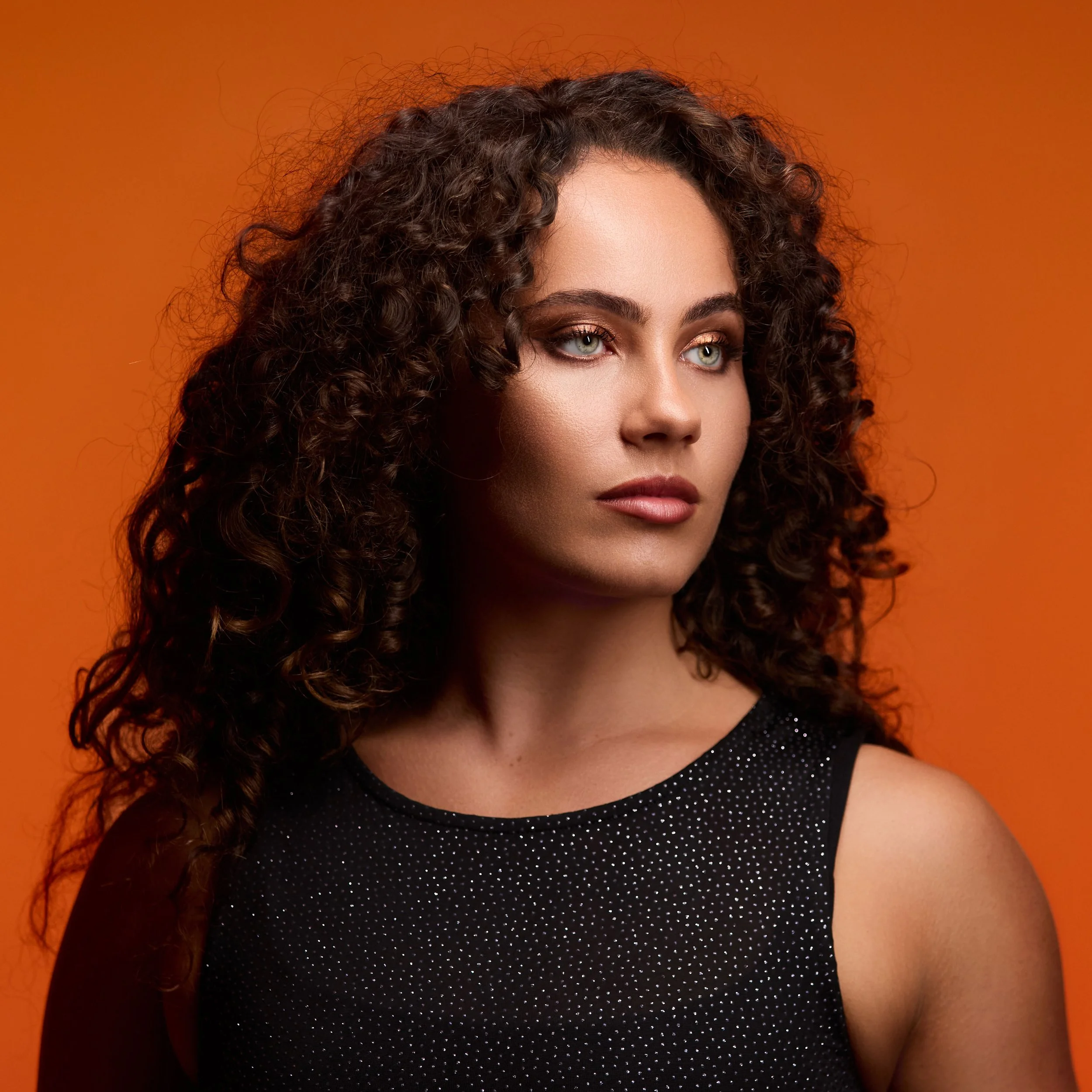
This portrait was built using a warm, harmonious (analagous) RGB palette to complement the model’s natural features and create an inviting, confident atmosphere. With careful colour selection, light placement, and spill control, the look was achieved in-camera without heavily relying on post-production colour grading.
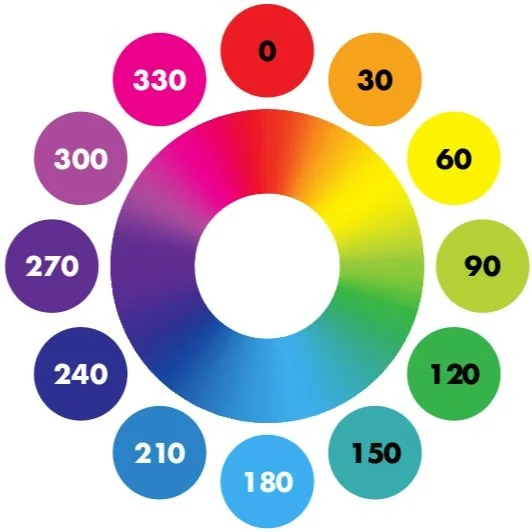
Choosing Colour Tones (based on complexion)
When using RGB lighting, matching tones to your subject’s complexion is essential for a flattering portrait, especially when working with RGB lighting. Different undertones respond differently to colour, and understanding this relationship can elevate your images.
Warm/Olive Undertones
Flattering: Warm reds, orange, golden yellow – enhance warmth and glow in the skin.
Caution: Avoid overly cool white and bright blues as it can make skin appear sickly; instead, use teal or turquoise accents for contrast without dullness.
Red Undertones
Flattering: Soft pink, peach, warm beige – balance redness while keeping skin tone even.
Caution: Avoid strong pure red as it exaggerates redness.
Cool/Blue Undertones
Flattering: Blues, purples, teal – bring out natural coolness in the skin.
Caution: Avoid overly warm orange/yellow, adding a subtle warm pink / peach can warm the complexion without clashing. Very cold white and blues can wash out.
Yellow/Green Undertones
Flattering: Warm yellow, light orange – harmonise with undertones for a natural warmth. Add warm pinks / peaches for a harmonious and flattering tone.
Caution: Avoid Greens or cool yellows, can make the skin look sickly. Too much magenta or blue-violet as it can make the skin look unnatural; deep purples work better for dramatic contrast.
Warm and Inviting
Alexandra, the model for this shoot, had beautiful mixed North African/Mediterranean skin with warm olive undertones and striking light green eyes. Dressing and lighting her in warm browns, oranges, and low-Kelvin whites was a natural choice.
Proud Deep and just a little Regal
By using warm white (3000K–3500K) lighting, we enhanced the warmth in her skin while adding depth and richness to her portrait. This tone paired perfectly with a deep orange to convey confidence, self-assurance, and approachability, without overwhelming the image with too many competing colours.
Process: How to Recreate This Look
Step 1.
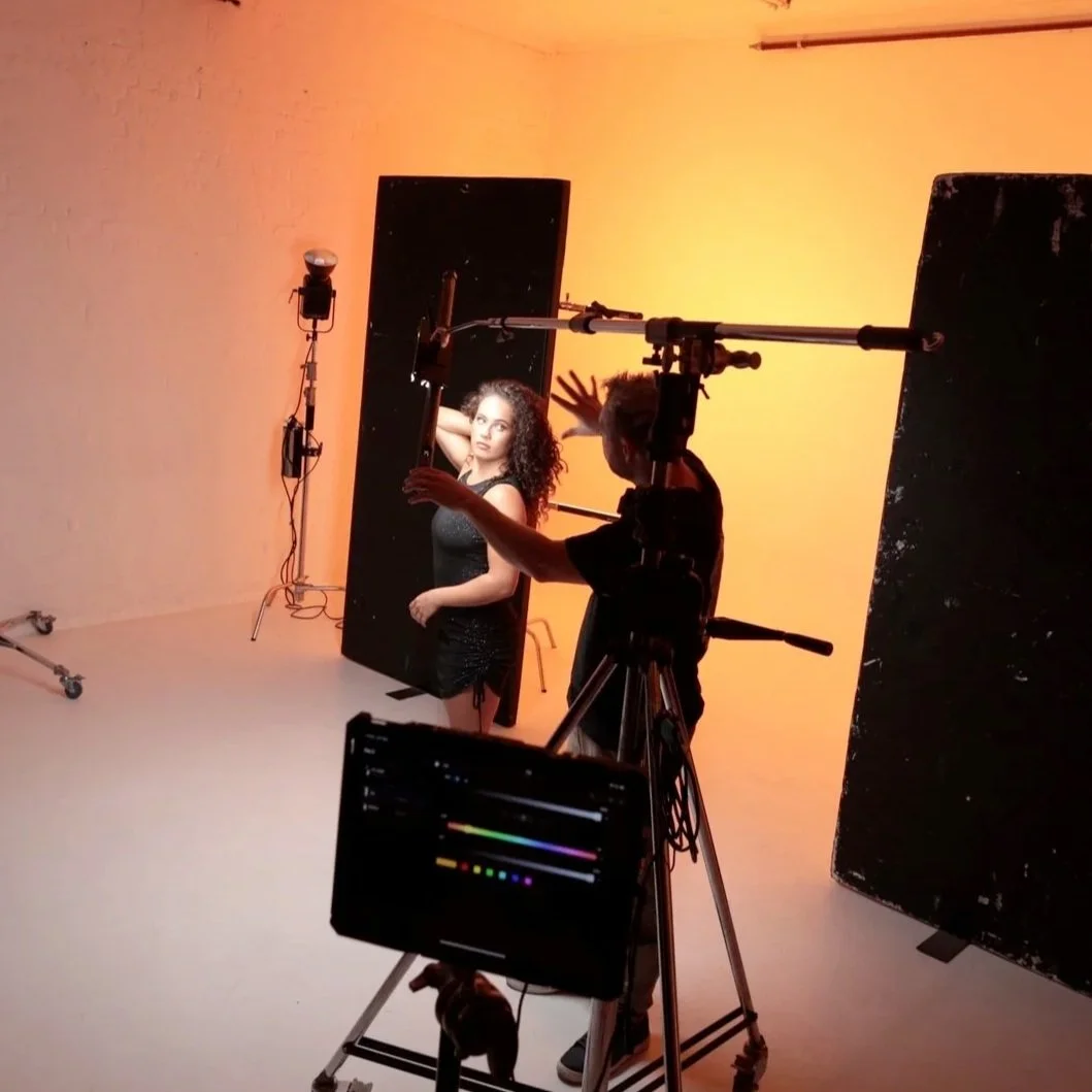
Background Lights First (4 PavoTubes on white wall)
I always start with the backdrop lights because they create they set the mood for the whole shot, and position your ideas on a solid footing before playing around with placements and models.

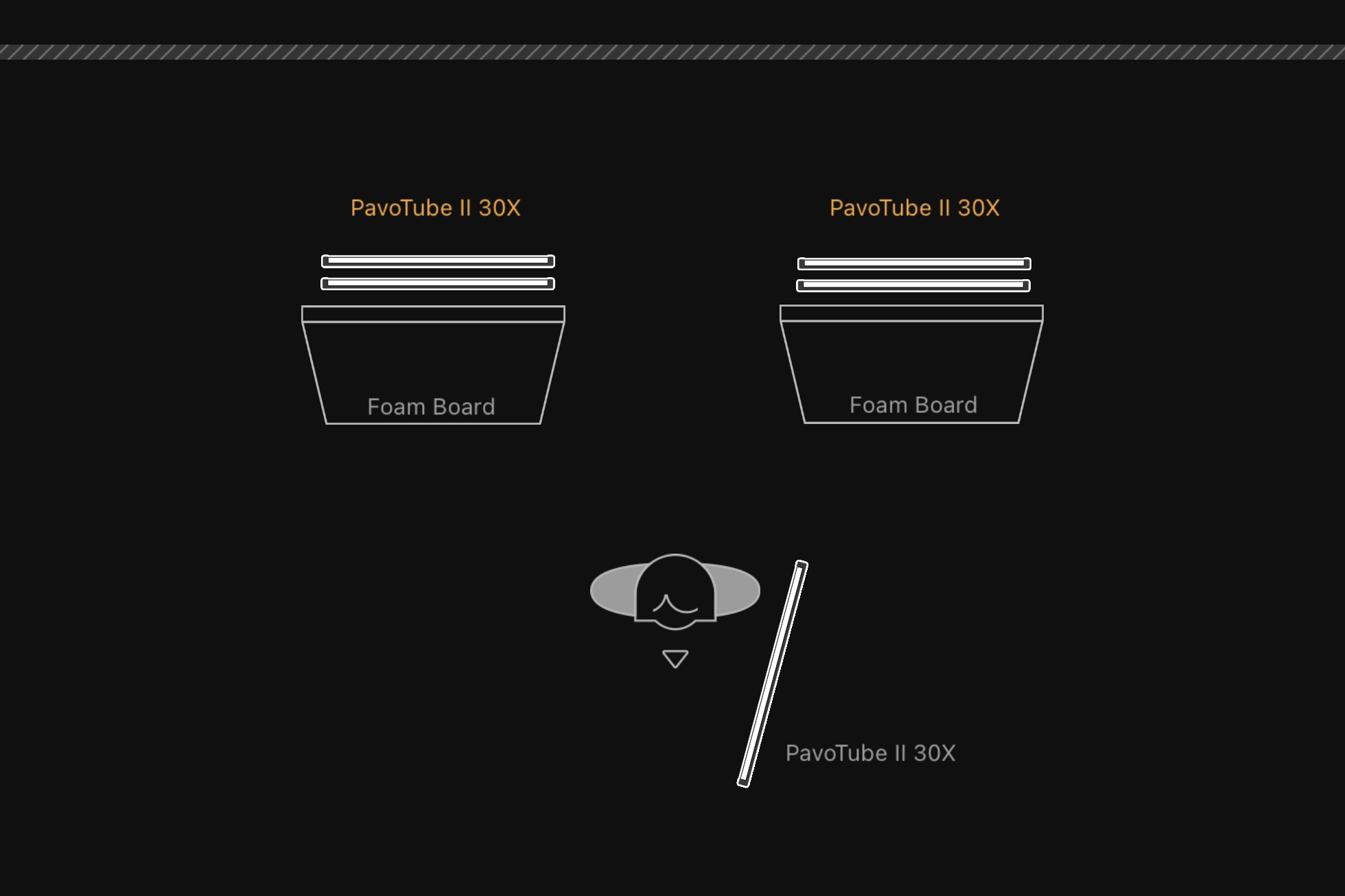
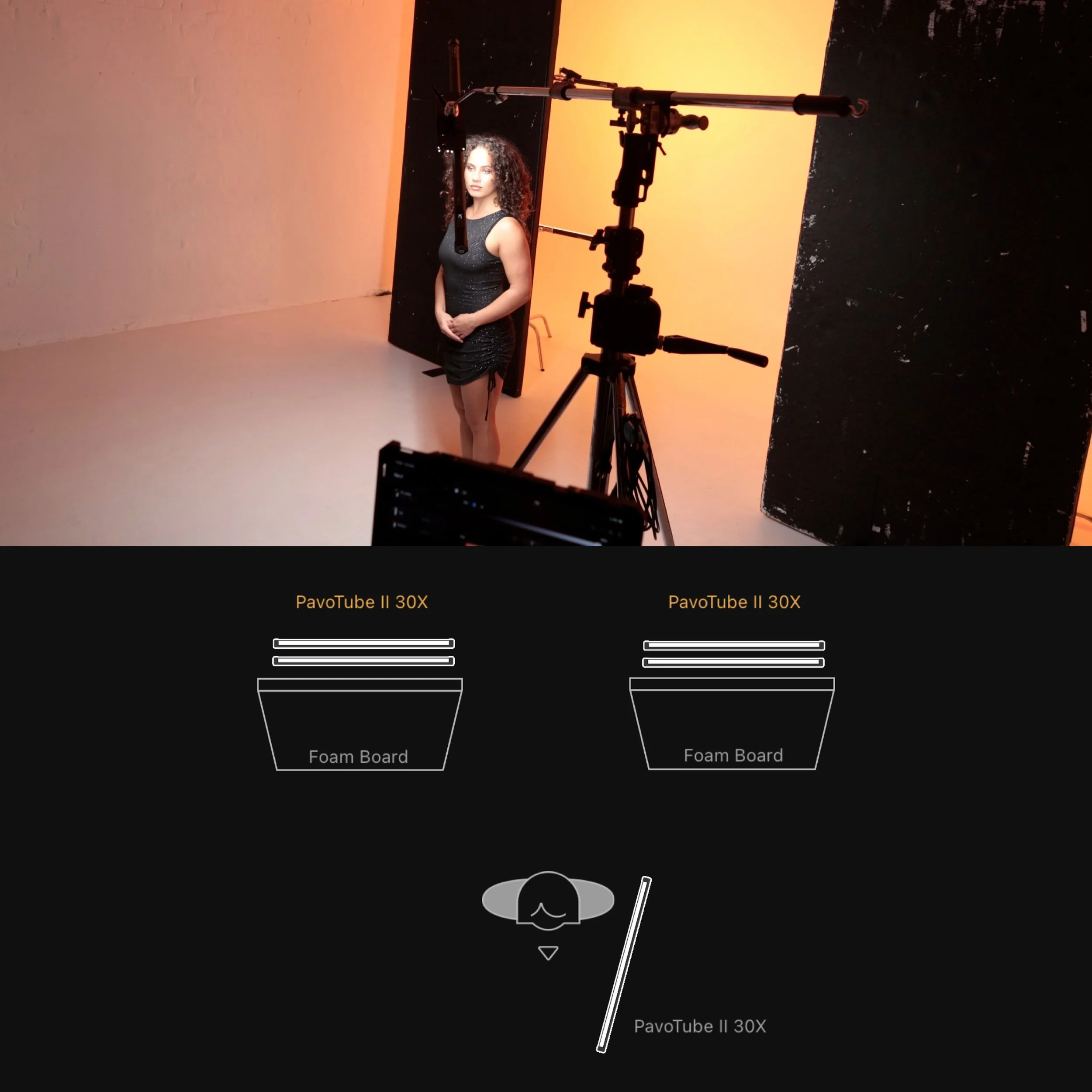
For this shot I used 4 PavoTube 30X 4ft RGB tubes, with 2 either side of the scene, facing a white wall.
TIP: This set up allows you to create Vertical or Horizontal gradients, depending on how you group your lights & colours.
Honestly, this setup was a bit overkill for this portrait (it was left over from an earlier shot that day). You could achieve a very similar look with a large RGB light, like the FC-500C, paired with a 120cm Octabox. Set it to full saturation and aim it at the centre of the ceiling to create a soft, bounced “room light” effect.
Step 2.
Stop that Spill (2-4 Polyboards between light and subject)
When using RGB lights, it’s super important to always think about how the light is spilling into your scene, and if that’s something you want or not in the final image.
For this shot I placed a couple of Black/White Polyboards parallel, in front of my lights, with the white facing the wall and the black facing back into my scene.
This serves 2 purposes, the white side bounces the colour spill back into the wall, adding to the intensity and vibrancy of the lights, and the physical wall stops any light hitting back into the rest of the room, with the black side absorbing any extra incidental light.
TIP: Start with 2 Polyboards, and depending on the size of your room, add more to the sides to avoid as much spill as possible.
Step 3.
Key Light (1 PavoTube)
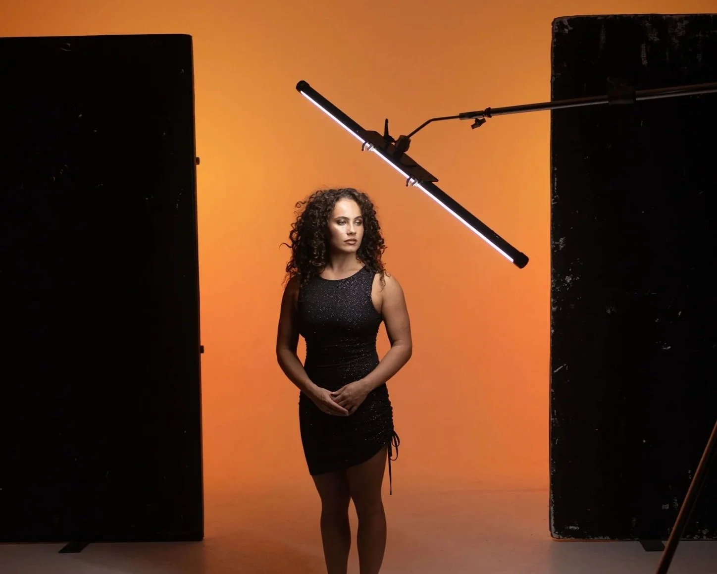
For this shoot, even though we were going for RGB portraits, we decided to use a little restraint, and go for a Warm White (3000K) instead of an Orange or Red. With RGB work, it’s worth remembering that you don’t have to go full-colour every time. White tones, or even subtle green/magenta shifts, can still give you striking results. Just keep colour theory in mind: if you’re after an analogous look, introducing a cool white into a warm scene will add contrast rather than harmony.
For this setup, the key light was placed at roughly 45º and slightly above eye level, giving a soft, flattering glow across the centre of her face.
TIP: Adjust intensity rather than distance when balancing the key with your background to maintain consistent softness.
Gear List
-
Cyclorama, Wall or White Seamless Paper Backdrop
Position: Backdrop
Role: Smooth, black surface to light with custom colour
Colour: White
Why: Essential for smooth, consistent colour coverage
-
Polyboard, Foam board, vFlat, Flags
Position: Between backdrop lights and subject
Role: Control light spill
Colour: White & Black 2 sided
Why: Bounce light back into wall & prevent light spill into scene
-
Can use a bright RGB Monolight with Large Softbox
Position: At the background, 2 lights at either side and behind subject.
Role: Create smooth colour on backdrop
Colour:
Orange at approx. H: 20 / B: 100% / S: 100%Why: Creates smooth colour wash on backdrop.
-
Can use smaller size RGB Tube or any RGB capable light
Position:
45º to camera right. 45º above eye lineColour:
Key: Warm White at approx. 3000K / B: 60%Why: Main light source; soft and glowy, illuminating the face and body
-
The Kupo LED Tube Holder combined with a c-stand and grip heads to hold 2 tubes, parallel to each other on one c-stand arm for the backdrop.
For the Key and Fill, we also used Kupo LED Tube Holders, but you can use the standard mounting clips that come with the PavoTubes.
-
Aperture: f/2.8
ISO: 500
Shutter Speed: 1/250s
-
Standard Zoom lens with focal depth of 14mm up to 70mm
Image shot at approx. 50mm
Summary:
This shoot focused on creating a striking portrait that radiates strength, confidence, and approachability. Using a single key light paired with a smooth, colour-washed backdrop, we captured a clean and powerful image.
I deliberately chose oranges and warm whites to complement the model’s rich skin tone and bronzed makeup. By keeping the lighting minimal, the portrait enhances natural beauty, highlights cheekbones, and maintains a flattering, effortless look.
It’s a great example of how combining RGB creative lighting with classic beauty portrait techniques (while exercising restraint with colour) can produce images that are not just visually stunning, but emotionally engaging as well.

Summarised (I Ain’t Readin’ All That):
Warm, flattering shot to invoke pride and confidence.
By carefully selecting colour tones that complement the model's warm undertones, the portrait achieved a flattering and harmonious look. using a warm, analogous RGB colour palette. The lighting setup, with warm white tones and deep orange accents, conveyed confidence and approachability.
What is RGB lighting?
RGB lighting is when you use red, green, and blue LEDs to create different colours on set. Mix them together, tweak the settings, and you’ve got full control over how your scene looks.
You can play with colour, build atmosphere, and get creative without needing a whole truckload of gear.
Basic to Elevation
RGB lighting is surprisingly easy to use, sometimes all it takes is turning on a single LED tube and letting the light bounce off the ceiling to instantly make a shot pop.
I’ve done shoots where that simple trick totally changed the vibe and made the photo stand out.
But if you want to really elevate your work, there are some next-level techniques I can teach you to take your photos beyond settling for ordinary - and push your creative boundaries.
